Transportation Planning
Urban SDK Unveils Delay Data, Route-Building Capabilities
Urban SDK has released a new suite of products that further enhance its traffic management software.
Urban SDK has released a new suite of products that further enhance its traffic management software.
Our latest product launch introduces a new suite of features and products that will dramatically increase the capabilities and experience of all users.
A major highlight includes the introduction of a location-based search approach, whicdh replaces data-specific Insights reports.
Users can now define geographic areas to view data layers, select routes for aggregated analytics, and enjoy improved map and chart designs for better legibility and accessibility.
These changes will revolutionize any interactions with data inside the platform, while also streamlining the user experience.

New Data Layers
Insights reports now offer eight new data layers across four categories — Traffic Speeds, Traffic Delay, Traffic Volume, and Road Networks.
Layers are now grouped by data type to make layer management simpler.
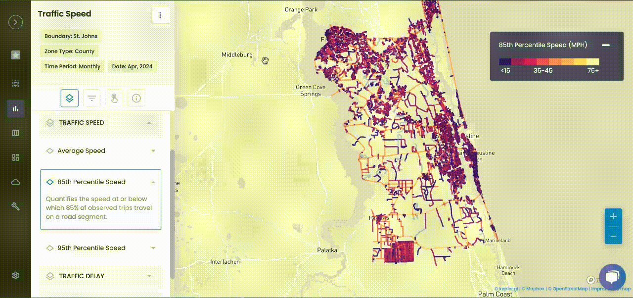
Traffic Speeds
Accounts have always had traffic speed data, with 85th and freeflow speeds. A new layer has been added under the Traffic Speed layer group:
- 95th Percentile Speed
Traffic Delay
Three new traffic delay layers have been added to quantify the impacts of congestion on travel time.
These layers include:
- Travel Time Index (TTI)
- Planning Time Index (PIT)
- Buffer Time Index (BTI)
Traffic Volume
Two new traffic volume layers have been added to quantify roadway vehicle usage.
These layers include:
- Volume (AADT range)
- Vehicle Miles Travelled (VMT)
Road Network
Two new road network layers have been added to show:
- Road functional class
- Speed categories
Simpler Data Access
Insights is transitioning from data-specific reports to a more intuitive, location-based search approach
Route Location Option
The ability to select and generate route-level analytics across multiple road segments has been added, enabling customers to compare route and segment-level analysis.
Daily Time Option
The ability to select a sample of two consecutive days of daily data has been added, offering the capability to analyze hourly data across the selected day range.
*Hourly data is currently only available for Route analysis.

Route-Building
Insights now offers the ability to create an aggregated route for corridor-level analysis. Customers can place points to generate their own routes.
Users can study individual road segments together in one route by placing or searching locations. Urban SDK’s routing algorithm will generate routes based on the shortest path between points.
Better Data Filtering
Route-Based Filtering
Routes offer the ability to aggregate to one corridor, or to view individual road segments for detailed analysis.
Customers can now select the segments filter to view individual segment operations to identify hot spots.
They can also select the Routes filter to see more holistic route-level trends.
Time Filters
Insights Reports can filter data based on time period.
Customers have the ability to filter to a specific hour to see the data visualized on a map.
*Time filters are limited to routes that are processed for Daily analysis
Accessible Colors and Basemaps
We've redesigned the colors for data layers and legends in Insights for better accessibility and legibility.
Basemap content and designs are now standardized with eight new color options that minimize distractions and highlight analysis:
- Coral
- Ocean Blue
- Pearl Green
- Light
- Dark
- Pine Green
- Navy
- Maple
All basemaps were designed uniquely for Urban SDK’s accessible data color palette to offer high-contrast designs. Customers can choose whichever color they enjoy, with all maps retaining the exact same layouts and no need to change label placement.
Like colors on the data layers, map colors were designed for accessibility
New Analytics Experience
The Insights analytics panel has been redesigned to adjust content based on the active layer and data filters.
We have removed redundant data labels, which creates simple, more focused experience.
The data charts within Insights have also been redesigned to use the same color scheme as map layer colors.
The chart heat coloring is now scaled based on the minimum and maximum value in the visible chart. This ensures that users can always quickly identify the highest and lowest values within the chart.

TRAFFIC ENFORCEMENT FEATURES
80% of citizen complaints
are a perception problem
Urban SDK provides precise hourly speed data to evaluate complaints and deploy resources efficiently for the greatest impact to public safety.
Urban SDK provides precise hourly speed data to evaluate complaints and deploy resources efficiently for the greatest impact to public safety.

Target Speeding
Identify hot spots, validate monthly speeding trends and monitor vulnerable areas like school zones.

Improve Safety
Crash and citations location information to compare speed trends month over month

Fast Response
Respond to citizen complaints sooner with address search and exportable reporting

Deploy Assets
Generate maps for traffic enforcement by time of day, location or division to deploy officers to known problem areas.
RESOURCES
Customer Success
See how public sector leaders succeed with Urban SDK.


WEBINAR
Identify speeding and proactively enforce issues
See just how quick and easy it is to identify speeding, address complaints, and deploy officers.