Transportation Planning
City Traffic Dashboards: Tips for Displaying Mobility Data
Learn how to design city traffic dashboards that display mobility data clearly for smarter urban planning
Creating a city traffic dashboard is all about making complex mobility data easy to understand and useful. A good dashboard helps both officials and the public quickly see what’s happening with traffic, including patterns and potential trouble spots. Here’s some good advice on how to make effective mobility dashboards:
Keep It Clear and Simple
Make sure your dashboard looks clean and is easy to use. Only include the most important metrics and stick to a neat layout. Avoid cramming too many charts or data points on the screen. Group related info together, like all transit stats in one place and all roadway info in another, so users can find what they need easily.
Focus on the key metrics, like average speeds and congestion levels, and skip the visuals that don’t add value. Using whitespace and a consistent design helps the main facts pop out. Remember that a busy dashboard can confuse people more than it helps.
Show Relevant Metrics with Context
Make sure the data you show is relevant to your audience and provides some context. For every metric you put out there, give a comparison—like showing today’s vehicle count alongside what’s normal for a weekday.
Sometimes just stating numbers can be confusing without context. Good dashboards include labels and maybe a quick explanation. It could show trends over time or compare today’s stats to averages from recent months or years.
For example, you might display "Transit on-time performance: 85% (Target: 90%)" or "Bike counts: 1,200/day, up 10% from last month." Providing context helps users figure out if a number is typical or if it signals a problem.
Explore related data: Traffic Volume Data
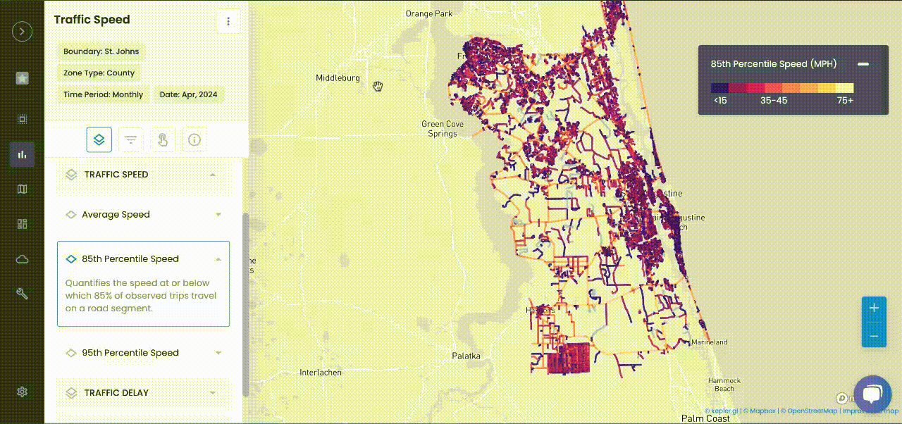
Choose the Right Visuals
Pick the chart types and maps that best showcase the data. Common elements include maps for location-based data—a live traffic map or accident hot spots—and line or bar graphs for trends like daily traffic counts or monthly transit ridership.
Using maps can really highlight patterns across the city. When showing data on a map, it’s a good idea to have clear legends and make it interactive, like letting users zoom in or hover for more details. For showing how people move around, consider using flow maps or Sankey diagrams, which can be simpler to understand than more complicated visuals.
See how planners visualize movement patterns with Mobility Data
Add Interactivity and Layering
Good dashboards often let users explore the data more deeply. For instance, a person could toggle between morning and evening traffic or filter the map for only truck traffic.
Features like tooltips that show specific values or clickable transit routes enhance understanding. You can also layer the data by importance—instead of overwhelming users with detailed data upfront, start with an overall view and let them drill down to the details if they want to.
Real-Time Updates and Alerts
Traffic conditions can change fast, so it’s super helpful for dashboards to update in near real-time. Many city dashboards pull in live data from sensors or APIs, like speeds from connected cars or the current locations of transit vehicles.
This lets you spot issues right away—like a sudden speed drop on the highway might suggest an accident. Dashboards can also feature alerts or color coding to highlight problem areas, like red/yellow/green indicators for congestion levels.
For example, during the pandemic, Austin's Mobility Management Center rolled out a Power BI dashboard that updated frequently to track changes in traffic flow, allowing staff to quickly see and respond to trends.
Learn how cities monitor live data using Traffic Congestion Solutions
Design with Users in Mind
Lastly, make sure your dashboard fits the needs of its users. A public dashboard might focus on big-picture metrics with easy-to-read graphics, while an internal dashboard might dive into more technical data.
Get feedback from users, whether they’re traffic engineers or everyday folks, to refine the design. It’s also important that the dashboard works on the devices it’s meant for, whether that’s big screens in control centers, desktops, or even mobile devices for field staff.
Accessibility matters too—use colors that are friendly for color-blind users and include alternative text for important insights.
Conclusion: Turning Data Into Actionable Insights
By following these tips, cities can build traffic dashboards that really work as valuable tools. A well-designed dashboard turns a ton of mobility data into clear, actionable insights quickly.
It makes it easier to spot strange patterns, support data-driven choices, and show stakeholders how well the transportation system is functioning. So remember: keep things simple, provide context, use the right visuals, and make it interactive. This way, your city's mobility dashboard will become a must-have tool for managing and planning urban transport.
FAQ: City Traffic Dashboards & Mobility Data
Q1: What are the key principles for effective city traffic dashboards?
Ans: Focus on clarity and simplicity. Display only the most important metrics, use a clean and consistent layout, and avoid data overload. Always group related information for easy navigation and understanding.
Q2: Which traffic and mobility metrics should be highlighted?
Ans: Highlight metrics like traffic volume, average speeds, congestion levels, incident alerts, on-time transit stats, and trends compared to historical data. Including context - like today’s numbers vs. typical values or city targets - makes stats much more informative to users.
Q3: What visual elements work best for traffic dashboards?
Ans: Use maps for location-based data (accident hotspots, live congestion), line or bar charts for trends (daily volume, ridership), and clear legends or color codes. Interactive features (zoom, filters, tooltips) help users explore patterns without confusion.
Q4: How important is real-time data and interactivity?
Ans: Near real-time updates and user interactivity are essential for relevance and engagement. Features like live maps, alerts, and drill-down options (by route, mode, or time of day) help users react promptly to changing conditions and explore deeper insights.
Q5: How do you design dashboards for different user groups?
Ans: Tailor dashboard detail for your audience: use high-level summaries and simple graphics for the public, more granular data for internal staff or engineers. Collect feedback and ensure the dashboard is accessible (color-blind friendly, mobile-capable).
TRAFFIC ENFORCEMENT FEATURES
80% of citizen complaints
are a perception problem
Urban SDK provides precise hourly speed data to evaluate complaints and deploy resources efficiently for the greatest impact to public safety.
Urban SDK provides precise hourly speed data to evaluate complaints and deploy resources efficiently for the greatest impact to public safety.

Target Speeding
Identify hot spots, validate monthly speeding trends and monitor vulnerable areas like school zones.

Improve Safety
Crash and citations location information to compare speed trends month over month

Fast Response
Respond to citizen complaints sooner with address search and exportable reporting

Deploy Assets
Generate maps for traffic enforcement by time of day, location or division to deploy officers to known problem areas.
RESOURCES
Customer Success
See how public sector leaders succeed with Urban SDK.


WEBINAR
Identify speeding and proactively enforce issues
See just how quick and easy it is to identify speeding, address complaints, and deploy officers.